
TinyTales Design Sprint

TinyTales is a story reading startup, designed around bedtime story reading. After many stories were published to their app, parents found it hard to sort through and find the right one to read to their child.
My goal was to conceptualize and test the search feature of the app. This was performed with a modified GV design sprint over a five day work week. The findings showed sorting by category with additional filters was the best way for our users to find a story to read to their child.
For this design sprint, each day was broken down by task. My role was to ideate possible solutions, then build a prototype to conduct usability tests with parents of young children to validate the solution.


Day One - Map the Problem
TinyTales provided me with the highlights of their user research. The target demographic is parents with young children. From the multiple interviews they conducted, synthesized into a persona, they found that parents want:
To spend less time finding a story to read to their children
To find stories that are age appropriate
To find stories by topic
To find stories that are entertaining, and educational
I consolidated the findings into problem statements that are open to many solutions.
How might we …
… help parents quickly find a great book to read to their children?
… help parents find books that can be understood for a varying range of ages?
… help parents more easily sort and filter stories?
Day Two - Ideation
I sought out apps that I knew had similar search features. I took screenshots and noted similar functions in the Disney+, Google Play Books, Amazon, and YouTube apps. I also looked at library apps and sites, but the ones I found were surprisingly not centered around finding a perfect book; opting to showcase events instead.
In the end I pulled inspiration from the sliding category sections of Netflix. I was particularly interested in trying out their “Characters” section that used large images of one character. I hypothesized that this would work well for younger readers to help their parents pick which book they wanted read to them. I also was inspired by Pinterest’s search bar. As the search is typed it would autocomplete and show recent search queries as well as ideas based on your history.


Day Three - Decide on direction
From the crazy 8’s exercise I decided to combine the best features from the different sketches. I hypothesized that a search bar would be a good place to start, especially if parents already had a specific book or idea. The category sections from the Netflix style and Pinterest style were very similar, so I combined those ideas to be a descriptive header and then swipeable images of books, or characters for younger readers.

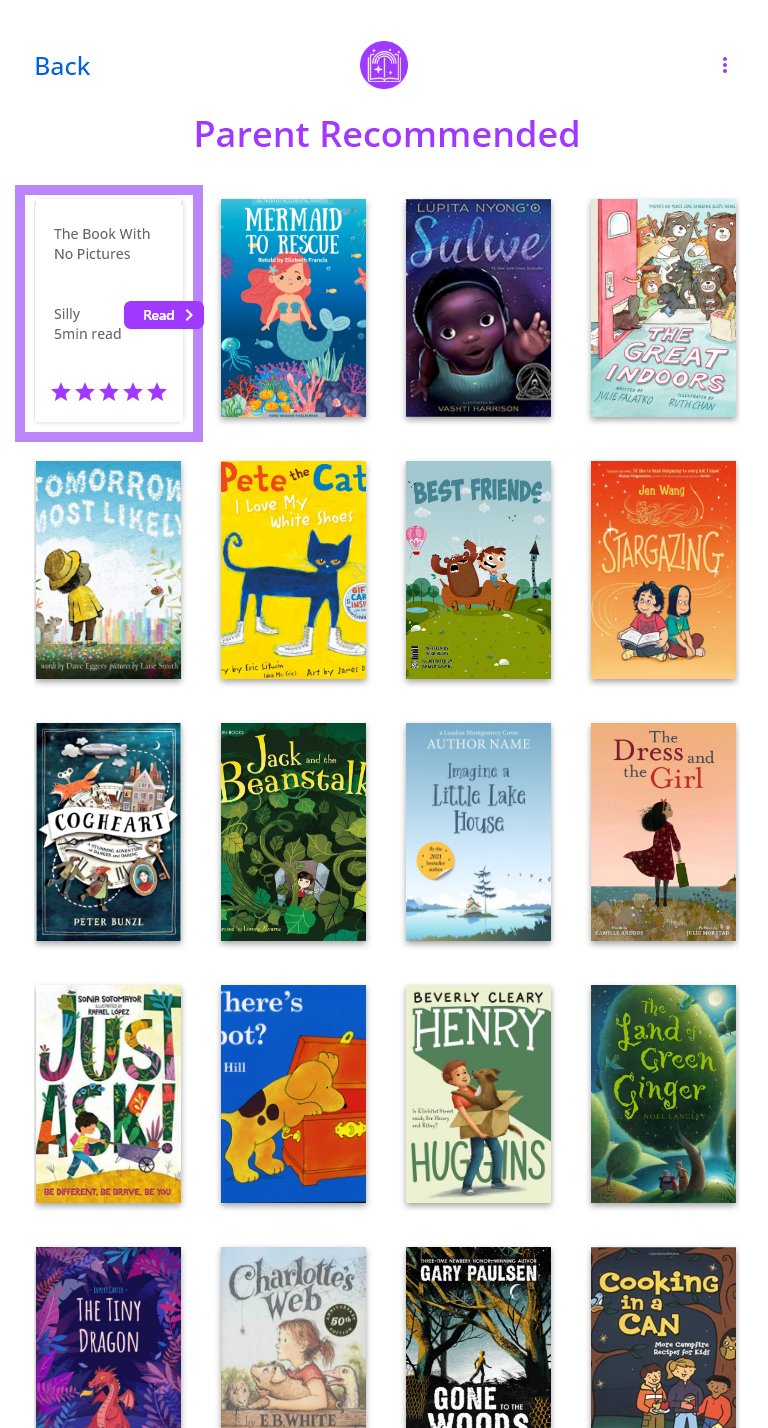
1. Home page: The parent will start with the home page where they will find a call to action about finding a story
2A. Finder page: This will have sorts and filters. The first main flow will be for younger children the options will include categories with large images of characters and animals.
2B. Finder page: The second main flow of the Finder page will be for older kids the categories will be changed to “series” and “classics”.
2C. Finder page: The third main flow of the finder page is for when a parent types into the search bar. This will bring up stories that are relevant to the search input.
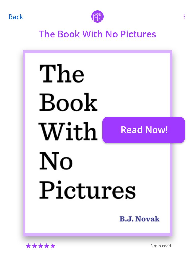
3. Search Details: After a parent taps on a category, they will be brought to this details view with many stories about that category. They can tap on one for more details. Will have a call to action to go read.
4. Success: The parent has successfully chosen a story to read to their child and can start the book.
Day Four - Prototype
The prototype was built in Adobe XD and helped me to get a little more concrete on concepts. Each iteration — Crazy 8’s to Solution Sketches to Storyboard to Prototype — became less abstract. Ideas for details naturally came out of the process of formalizing what was included and what wasn’t, aligning with the research. Then going from XD into the Invision web app a few more tweaks had to be made.
From usability testing, I hoped to learn whether the search inputs are understandable and usable; especially the range slider UI. I also hoped to find out what other ways users expected and wanted to search. At a high level I wanted to see if they can get through the flow of finding a story to read to their children.
Link to the Invision prototype: https://aaronlewis729876.invisionapp.com/console/share/YAUNEM492BJ


Day Five - Usability Testing
Five usability test participants were selected from the community and church, ensuring that they fit the demographic of parents of young children. Testing was conducted in the participant's home for their convenience. After an introduction I took time to get to know the participants, to build rapport and understand their thoughts on reading to their children. The sessions were recorded with Google's Recorder app to enable me to listen back and pickup notes I missed in the moment. For this project it was difficult to be the observer and the note taker and moderator. The Recorder app helped alleviate this issue and I was able to be in the moment and not worry about scribbling unreadable notes as fast as possible.
After the intro time the Invision prototype was given to the participants and they were asked to give their first impressions from the home screen; what they thought the app was for and what they thought they would do with it.
Task: The participants were told to imagine sitting down with one of their children at bedtime and wanting to pick out a story to read. They were asked to use the app to find a story for their child.
Overall Insights
The overall finding section worked well. There were preferences about adding a couple more “types” to the filtering.
Some filtering would be good for younger children, but not useful for older children.
Most parents said they would start with a specific search, and then filter down from those results.
Parents liked the details before the final “Read Now” tap, but would like a few more details, like a more full description of the book.
Detail pages and lead-in to opening the book had no issues.
Recommendations
Consider adding same category sections (headers with book covers underneath that are slideable), to the Home page.
i.e. Start with large sections of books for the parent to peruse, and then add filtering to that within the same screen
Keep most filter options, but remove the “Find A Story” page.
The “type” filter was debated on usefulness. Consider turning each of those “types” into a page section, like the categories below.
Silly books, Inspiring books, Learning books would each have their own section on the main page, not within the search filter.
I would make these updates to the prototype and then test again. After I felt that the design was in line with parent's wants and mental models, I would work with the development team to implement these screens.
Final Thoughts
I enjoyed the Design Sprint method for UX design. It obviously was faster, but the benefits were more than I expected. It was helpful to have fast deadlines, coupled with clear activities and tasks, to help keep the motivation high. There was no time for lags or pauses or thinking too deep into things. It was, "think of an idea, build a model, go see if it works!" I also liked the mindset of failure as valid feedback; to see that a test didn't work and figure out why. It's just as valuable to find out the wrong solutions are on your way toward a better solution. I also liked the idea of focusing on a single moment in the user flow, not tackling the whole app from soup to nuts. I plan on applying this Design Sprint method a lot in my upcoming jobs.