
Lifesaver Scheduling web app
Lifesaver Scheduling is a tech startup trying to address the need for better digital staffing solutions targeted specifically to Aquatic Centers. The key differentiators from other scheduling apps are the ability to track staff credentials and certifications, and the ability to handle union and seniority rules for scheduling decisions.
I collaborated with another designer to assess the company’s first prototype, iterate the design, test with target users, and update the web app prototype according to user feedback.
Kickoff
In our first stakeholder meeting we met with the founder of Lifesaver Scheduling. We asked many questions to better understand the project, where it was in its lifecycle, who we were designing for, and what the problem was she was trying to solve.
After the initial meeting, as a design team of two, we discussed the scope of deliverables we could produce within our four weeks worth of work. We decided that I would take the lead on the research activities, my teammate would take the lead on more of the UI activities, and we would both help each other where needed, especially the prototype building.
I also discussed the scope with a design mentor who helped me see a blindspot by asking about the initial research that had been done by the Lifesaver Scheduling. We had asked about the end users, but failed to ask for the initial research to make sure it had been done and wasn’t just in the founder’s head. When we asked for all of the initial user research we were happy to find that it had been done and was made available to us.

Who we are designing for
Potential clients:
Aquatic Centers, many City owned
Admin:
Managers who would use the app for scheduling and tracking credentials
Staff:
Other employees who will use app for scheduling and notifications
Constraints
Four week window to accomplish our scope
Web app to be platform agnostic
Build prototype in Figma
First Steps
The first activity I did was to read the initial user interviews and find the highlights and insights. I created an affinity map and user persona for the admin role in a digital whiteboard app called Miro. My design coworker did the same for the staff role research.

Persona

Red Routes
We learned from the research and the founder’s input that the most important flows were:
Scheduling based on seniority or other union rules
Credential tracking
Swapping shifts: requesting off and filling open shifts
Setting staff availability
I conducted a quick and simple usability test with myself and two other people who had not interacted with the V1 prototype. The V1 prototype that Lifesaver Scheduling had designed had all of the right pages and flows accounted for, but there were some UI issues that needed to be addressed. My teammate created user flows for the red routes to help us see what elements were needed.
Ideation
Of the four main red routes, I took ownership of the design for the Credential Tracking page and the Open Shifts page for the admin side. I did a quick lightning-demo style search for other apps with similar features to act as idea generating elements. In other words, I wanted to see how other people solved similar interactions. I carried out a Crazy 8’s activity for both pages, then sketched what I thought were the best elements from all of them together. The Credentials page was three steps forward and one step back.

With the Crazy 8’s I was trying to find ways that were different from the current V1 prototype just for the sake of being different; so that I could say that I changed it completely for the better. I had a feeling like I wasn’t doing something right though.
“Don’t try to be original. Just try to be good.”
- Paul Rand
I remembered a quote from graphic designer Paul Rand who said, “Don’t try to be original. Just try to be good.” I didn’t need to reinvent the wheel. I drew the iterations of how to change the page, but after I reflected on it, I feel like the functionality of the Credentials page needed to be simplified, not overhauled completely. I’m still glad I did the Crazy 8’s, because you don’t know what the good ideas are until you know what the bad ideas are also. It also taught me to look for the good in other’s designs, not to throw everything out when iterating a project.
First Prototype Iteration
My teammate and I then made a copy of the V1 prototype for Lifesaver Scheduling and iterated our red route pages into a V2 prototype. I have been working primarily in Adobe XD before this project. Figma was a learning curve for me. My teammate was able to help me learn many functions and features.
Our design team of two was a good match. I was able to mentor him on good UI practice that I was more experienced with, and he was able to teach me tools I hadn’t touched before like Figma.
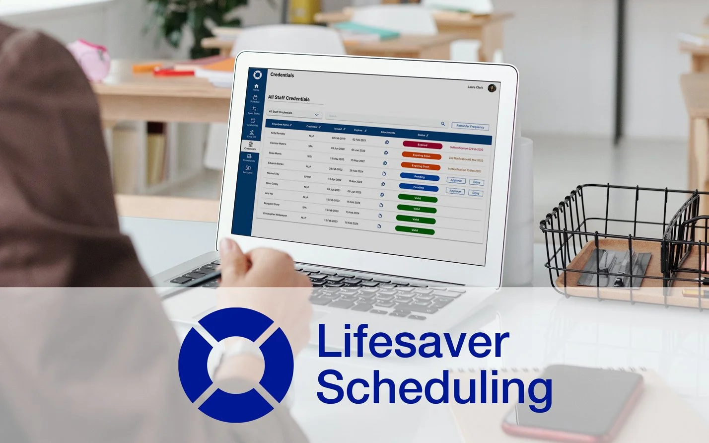
Credentials page:
The guerilla testing taught me that the Master List view of the Credentials page was less important. I changed that so the first view will be the higher priority Pending Credentials view. I also added an attachment modal to show staff submitted forms. The email icon was ambiguous and I updated it to indicate that the staff has been notified and added a “Remind All” button. I refined the UI by aligning it to a 12 column grid and giving the tabular grids more space for data.

(original design)

(my updated design)
Open Shifts page:
I felt that the page name was ambiguous, so I changed it from “Shift Board” to “Open Shifts”. I also combined the “open shifts” and the “requested shifts” sections into one section that handled both. I changed the backgrounds to reflect the same colors for role types and styling of shifts from the scheduling page.

(original design)

(my updated design)
Usability Testing
For our usability testing, the founder was able to reach out to contacts in the aquatic center field, some managers and some lifeguards. We chose to test five participants, based on research done by the Nielsen Norman Group showing that to be sufficient with diminishing returns above that. I wrote a research plan and test script for the founder and our team to be on the same page.
I facilitated the usability tests via recorded Zoom video calls. The founder wanted to sit in, to ask questions where she wanted clarification and to learn from the users and from us designers on how we conduct these tests. My teammate was also present, but acted as an observer, taking notes and making sure I didn’t miss anything.
My favorite technique for usability tests is to answer questions with a question. They might ask, “What happens when I push this button?” to which I respond “What would you expect to happen when you push it?” I know the design intent behind that button, but in this case it’s more important for me to hear what they think, want, and need out of the solution than what we started with. And if they align then even better. This kind of question helps me see if the user understands the intent behind our designs, and if not how we can improve that.

Usability Synthesis Report
The usability tests showed us that most of the app worked as intended and was understood by the users. Impressions of the app’s design and content were mostly positive.
After the usability tests were complete, I wrote notes for each one and highlighted areas of improvement. Then I compiled those items into a Usability Test Report and ranked the list of improvements by highest priority: Critical, Major, Minor, and Normal. The design team met with the founder and came to an agreement on the priority of items to improve.
Highest priority to improve on the pages I was over:
What employee information to show when helping managers assign shifts
On the Credentials page the “Remind All” button was confusing
Second Prototype Iteration

Last, with feedback from the users on issues that needed improving we discussed as a design team ways to solve for each. For the Credentials page I decided to remove the ability to send notifications ad hoc to individual staff about expiring credentials. The users specifically said that if the backend of the app was reminding them on a regularly scheduled interval about expiring credentials they would not need to remind them at all as a manager, saving more time. So I designed a popup modal to input how far in advance and how many times the manager would like the app to remind the employee to take care of their credentials.

On the Open Shifts page and the Schedule page managers wanted to know:
The employees were available and credentialed for the role/shift
How many hours the employee was scheduled for this week
The seniority of the employee
Number of desired shifts per week

I helped mentor my teammate through UI principles and practices. I told him the most important things are that there is a clear visual hierarchy, that things are aligned (preferably to a grid), and that visual elements are consistent throughout the app. We helped each other as we got stuck mentally and gave feedback to improve each other's designs. Since I have been a working UI designer for a while, I let my teammate take the lead on the style guide, helping where needed. By the end of the project I started to understand features and methods of using Figma, with help from my teammate.
Pages I specifically oversaw the design of:
Admin
Credentials page with three different views
Open Shifts page
Time Off Requests
Staff
Dashboard page
Open Shifts page
(my updated design)
Final Notes & Next Steps
In the end, this project’s prototype is now ready for the founder of Lifesaver Scheduling to show potential clients who can then give letters of intent to help secure funding for the development of this web app. Our last stakeholder meeting was very positive. We all talked about how well we got along as a team. The founder was involved throughout the process. The app design was a good way there in features to begin, but we were able to build it up
Here is what I would do next for this app:
Give more design time to the non-red route screens. We cleaned them up, but they could use usability testing as well.
Decide what pages features will make it into the minimum viable product: likely the red route flows.
Responsive design: We designed for a wide screen web app, but because the app is platform agnostic, it would help, especially for employee scheduling/availability pages to be more easily viewed on mobile.
Consider for a future release messaging. Currently there are notifications from the backend of the app, but not chat messaging between managers and staff, or between staff and other staff about shift trading and such.